Receipts, not claims
Proof over promises.
We're new to trades — we won't pretend otherwise. What we do have is a documented track record of building audiences and ranking websites. Below is the evidence. You can judge whether that translates.
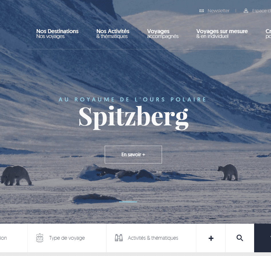
Complex, conversion-focused websites
Professional design & development
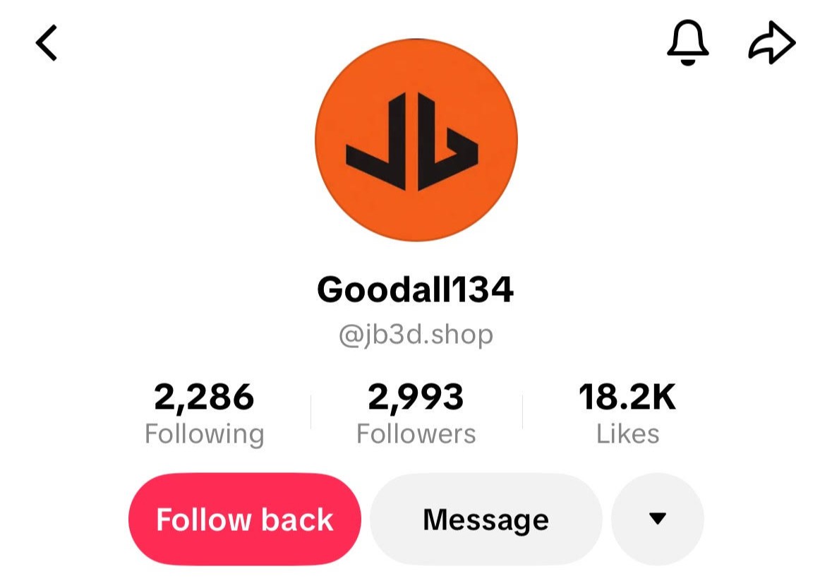
3k followers in the first week
TikTok — organic, no ads
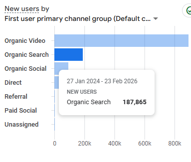
187k visitors from Google SEO
Organic search traffic growth

1.8M views across 90 days
TikTok dashboard — organic reach

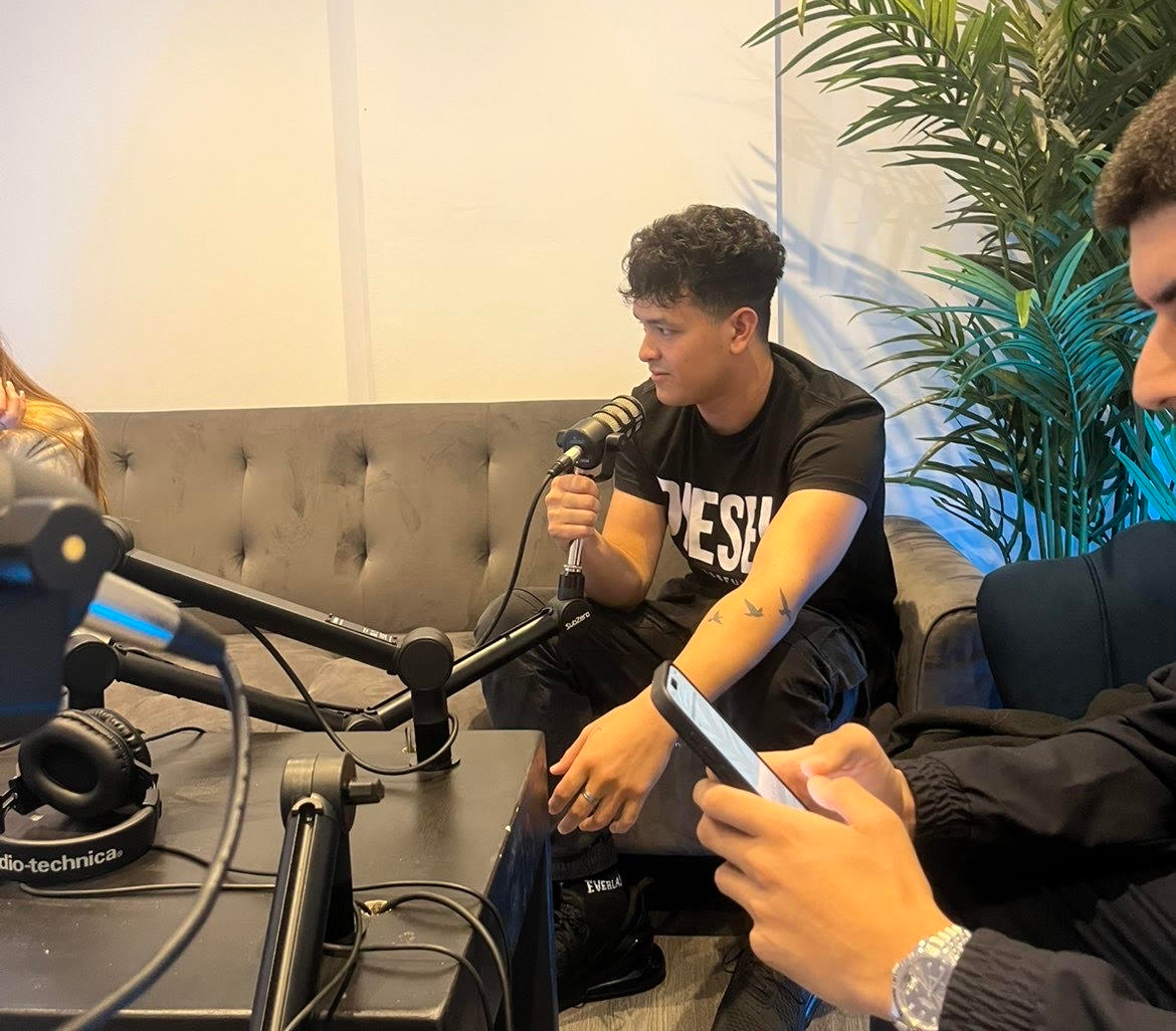
Professional video production
On-location filming for trades & businesses
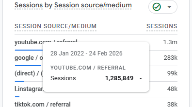
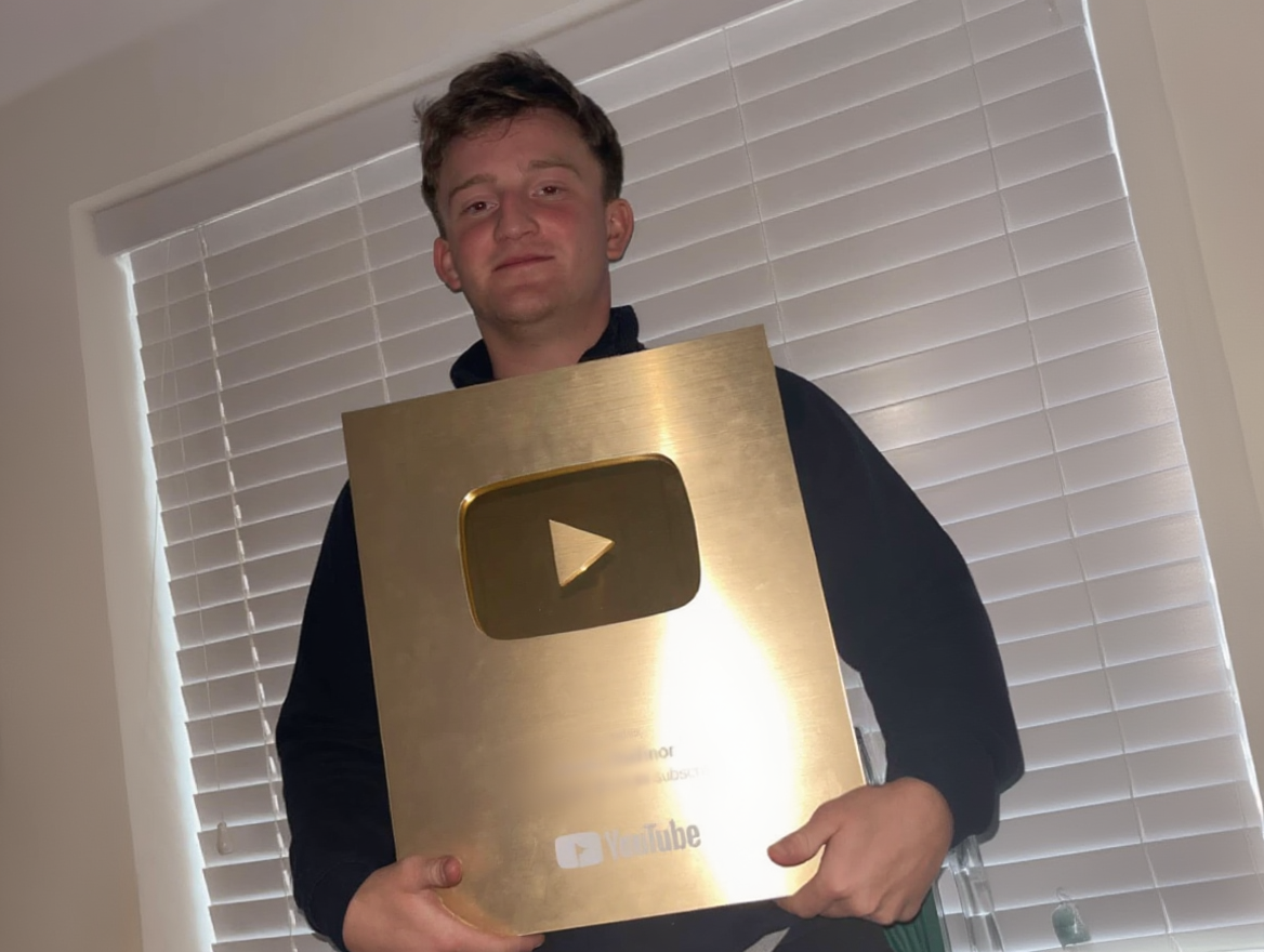
1.3M website visitors from YouTube
Sessions tracked in Google Analytics
Complex, conversion-focused websites
Professional design & development
3k followers in the first week
TikTok — organic, no ads
187k visitors from Google SEO
Organic search traffic growth
1.8M views across 90 days
TikTok dashboard — organic reach
Professional video production
On-location filming for trades & businesses
1.3M website visitors from YouTube
Sessions tracked in Google Analytics